
Brand Design • Identity System • Packaging & Application
Building a Cohesive Brand Identity for Cafe Vallarta
Project: Cafe Vallarta Brand Identity
Role: Brand Designer / Visual Designer
Tools: Illustrator, Photoshop
Outcome: Developed a cohesive brand system across logo, packaging, and supporting assets
Who I Worked With: Collaborated with Cafe Vallarta to create a visual identity that reflects the heritage, quality, and personality of the brand.
Background
Cafe Vallarta is a coffee brand rooted in tradition and craftsmanship. The goal was to create a visual identity that captures its heritage while elevating its presence across packaging and brand touchpoints.
Problem
No cohesive visual identity across brand touchpoints
Existing branding did not fully reflect the brand’s heritage
Packaging lacked consistency and visual impact
Needed a system that could scale across multiple applications
Goals
Develop a cohesive and recognizable brand identity
Reflect the heritage and quality of the product
Create a flexible system for packaging and brand assets
Ensure consistency across all touchpoints
Design Process
The process focused on translating the brand’s heritage into a modern, cohesive visual system. Exploration included logo development, typography, and supporting elements that could scale across packaging and brand applications.
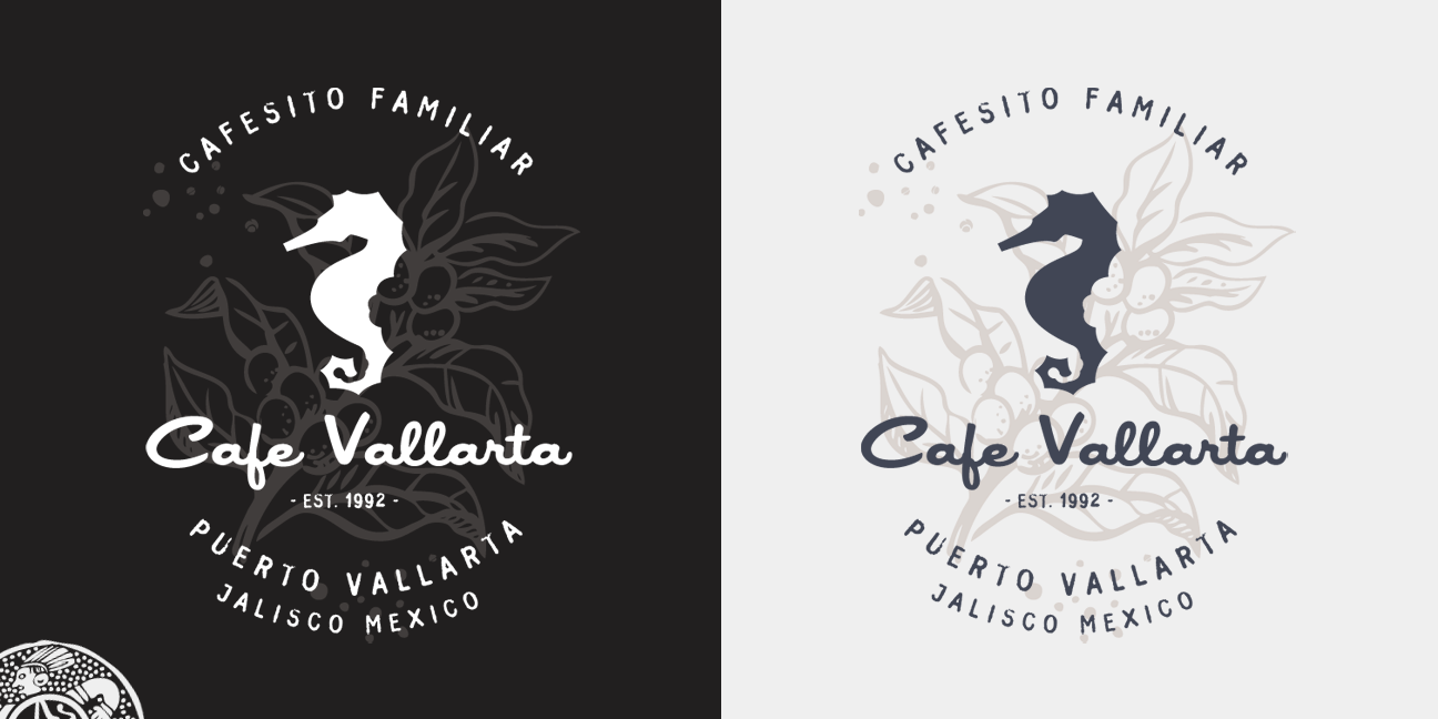
Logo Development
The logo was designed to reflect both tradition and character, combining illustrative elements with typography to create a mark that feels distinct and recognizable.
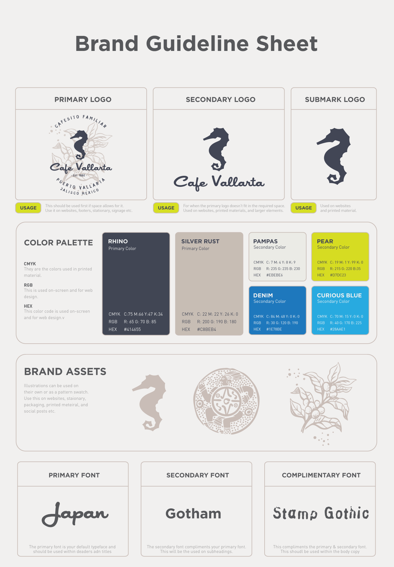
Visual System
Supporting elements—including color, typography, and graphic details—were developed to create a consistent and flexible system that works across different formats and applications.
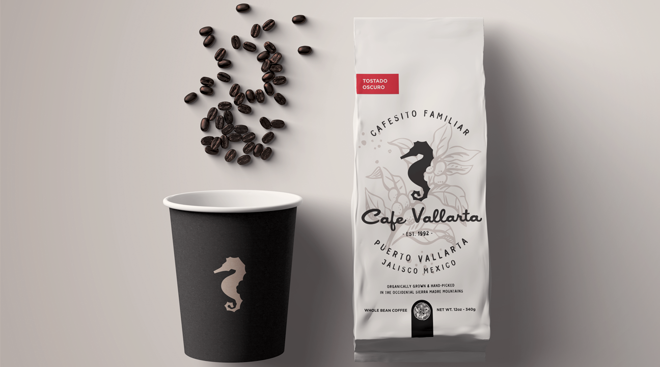
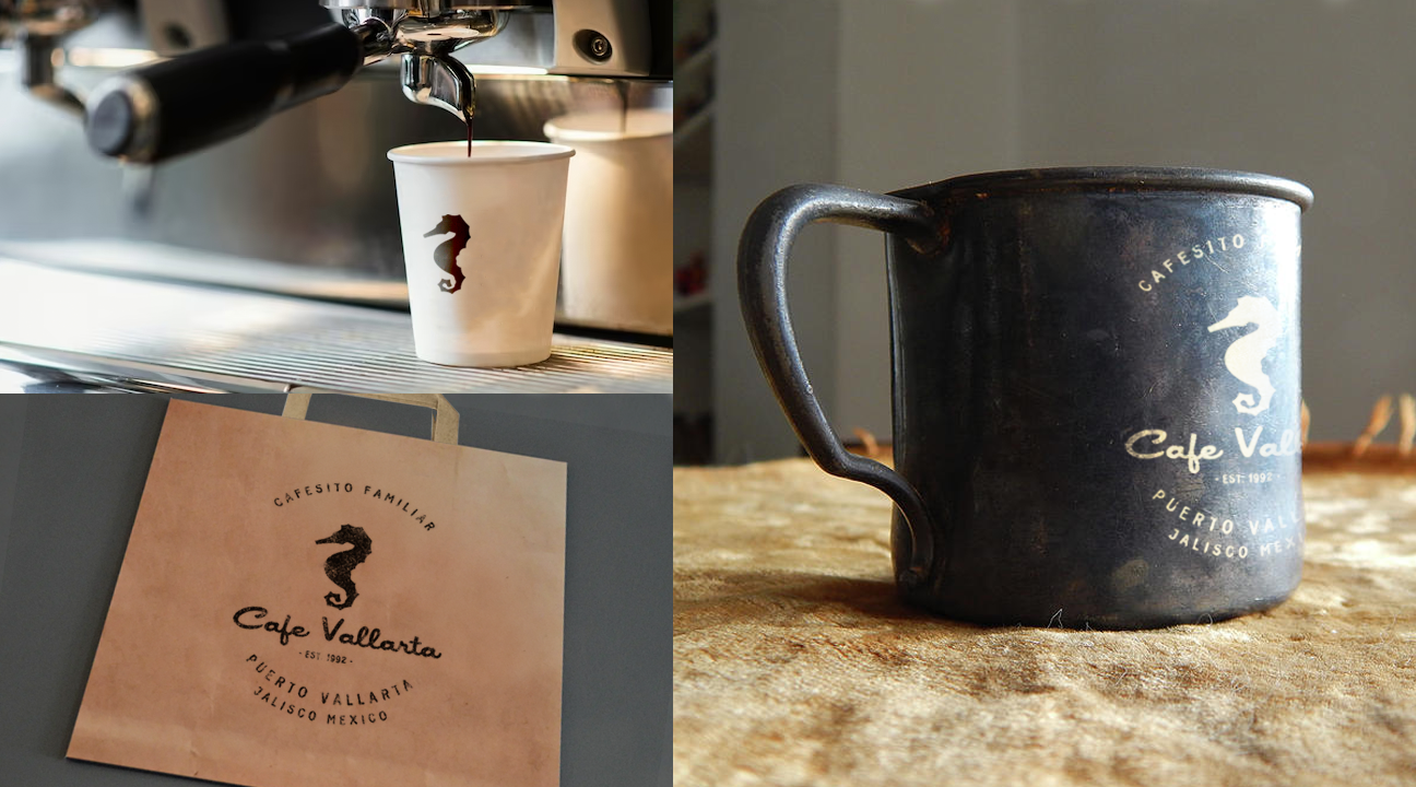
Packaging
Packaging design brings the brand to life, applying the identity in a tangible way that reinforces quality and consistency.
Layout and structure were carefully considered to ensure clarity, balance, and consistency across different formats.
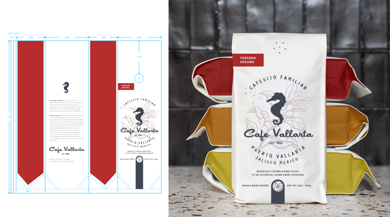
Packaging uses a separate color system to differentiate roast profiles, while the core brand palette remains consistent across other touchpoints.
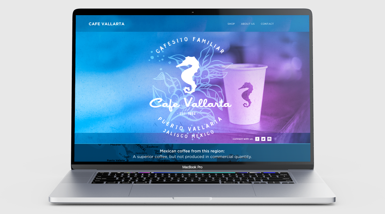
Applications
The identity was extended across multiple touchpoints, including packaging, digital, and print, ensuring a cohesive and unified brand experience.
Conclusion
This project demonstrates how a strong visual identity can unify a brand across multiple touchpoints. By building a cohesive system, the brand is able to communicate its story more clearly and consistently.
Learnings
This project reinforced the importance of building flexible systems in branding—ensuring that a visual identity can scale across different applications while maintaining consistency.
Future Learning
Future iterations could expand the brand into additional product lines and digital experiences, further strengthening its presence and consistency.