Improving Class Booking for a Pilates Studio
UX/UI Design • Mobile Experience • Booking Flow Optimization
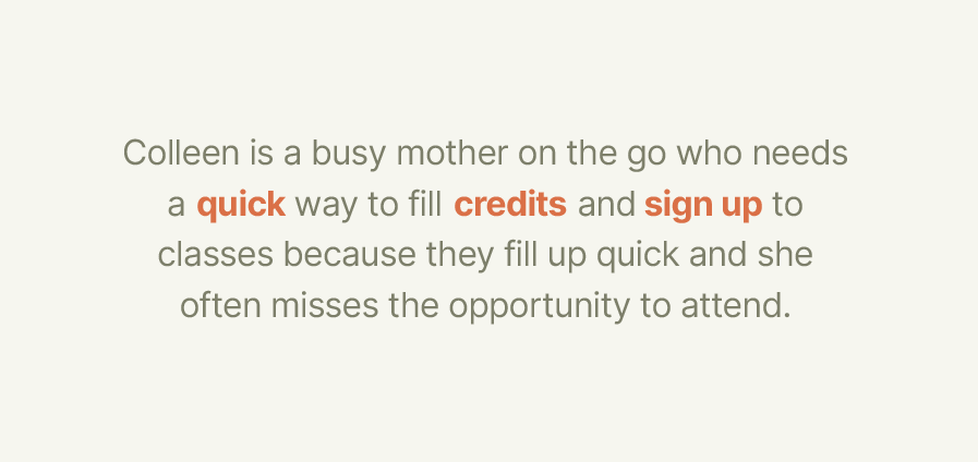
Project: Yellow Dog Pilates UX Redesign
Role: UX/UI Designer
Tools: Figma
Outcome: Improved clarity and reduced friction in the class booking experience
Background
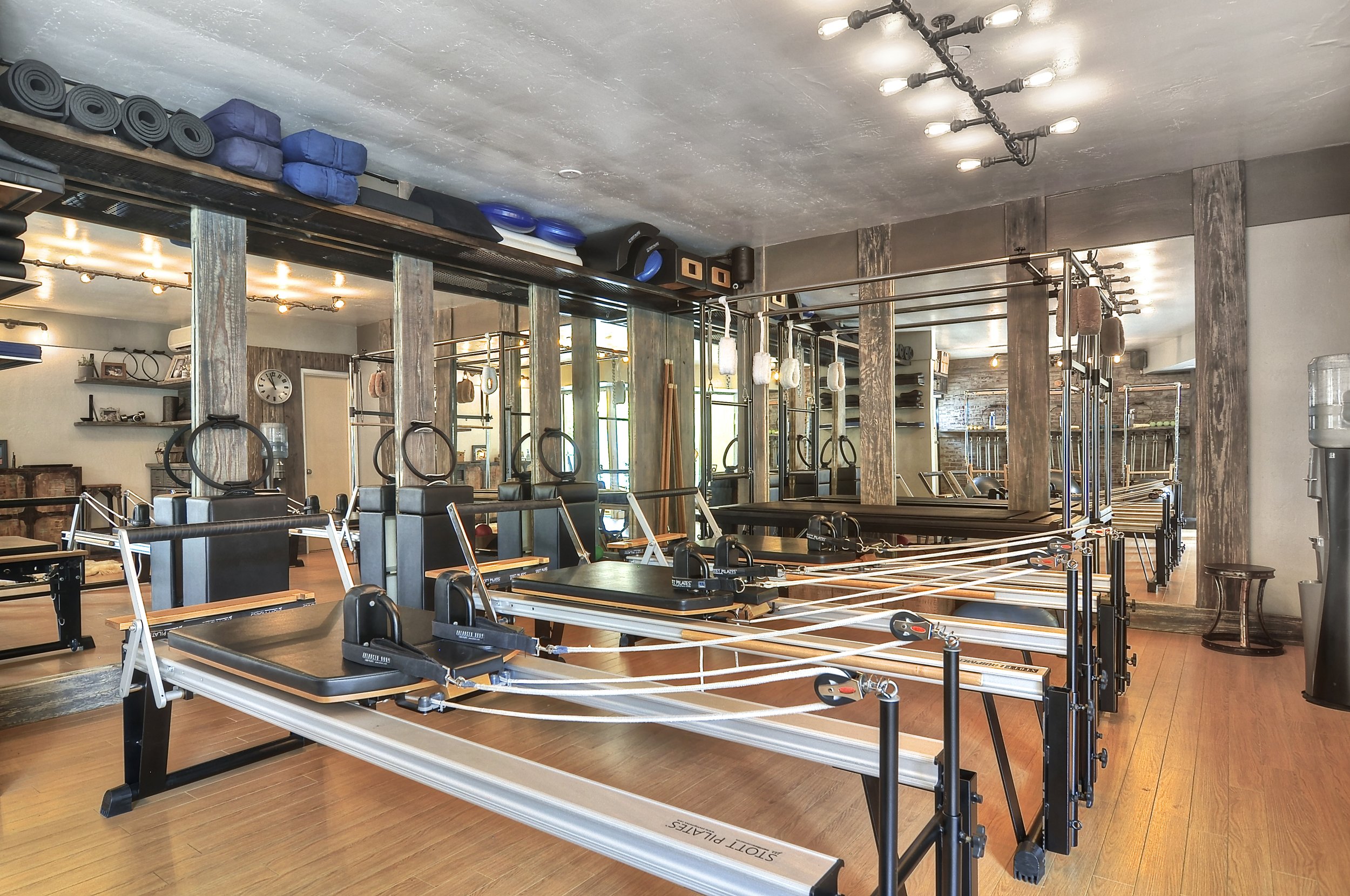
Yellow Dog Pilates offers a range of classes for users with varying schedules and experience levels. However, the existing booking experience made it difficult for users to quickly find and reserve classes, leading to missed opportunities and frustration.
Problem & Goals
Problem
Users struggled to quickly find relevant classes
The booking flow required multiple steps and felt fragmented
Important class details were difficult to scan and compare
Goals
Simplify class discovery
Reduce friction in the booking process
Improve clarity of class information
Create a more intuitive and efficient mobile experience
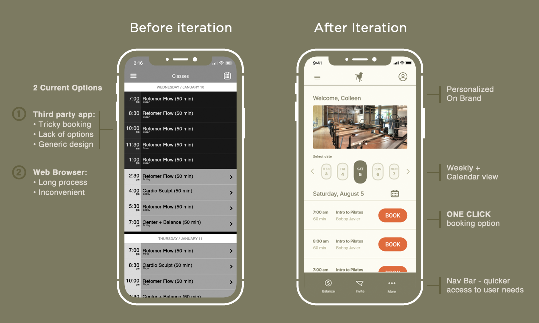
From Complex to Streamlined Booking
Before
Cluttered interface made classes difficult to scan
Key information was buried or unclear
Booking required too many steps
After
Clean, structured layout improves readability
Clear hierarchy highlights important details
Streamlined flow reduces time to book a class
User Insight
Busy users don’t have time to navigate complex booking flows. If the experience isn’t quick, clear, and easy to scan, they are more likely to delay or miss booking a class altogether.
Process Intro
To address these challenges, I explored ways to simplify navigation, improve information hierarchy, and reduce the number of steps required to complete a booking.
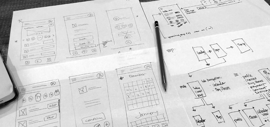

Sketches / Early Ideation
Early exploration focused on simplifying layout structure and identifying the most essential elements needed for users to quickly browse and select classes.
Wireframes
Wireframes prioritized clarity and speed, focusing on making class information easy to scan while reducing unnecessary interactions in the booking flow.

UI Exploration / Design System
Visual design focused on creating a clean and approachable interface, using clear typography, spacing, and color to guide users through the experience without overwhelming them.
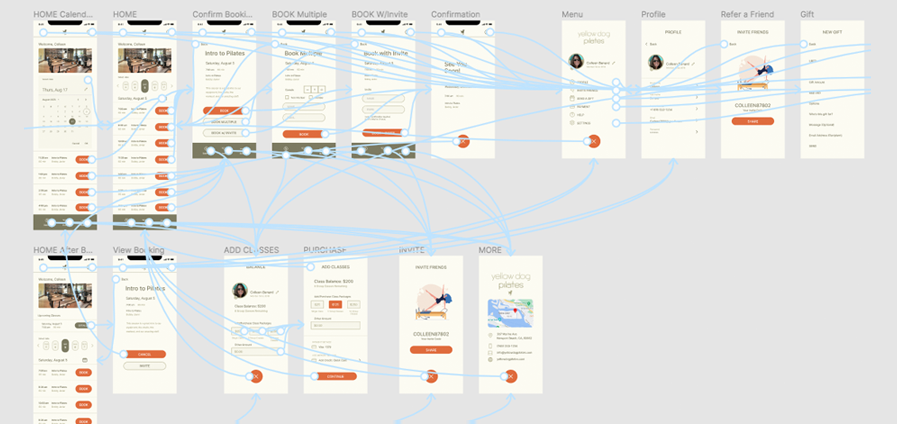
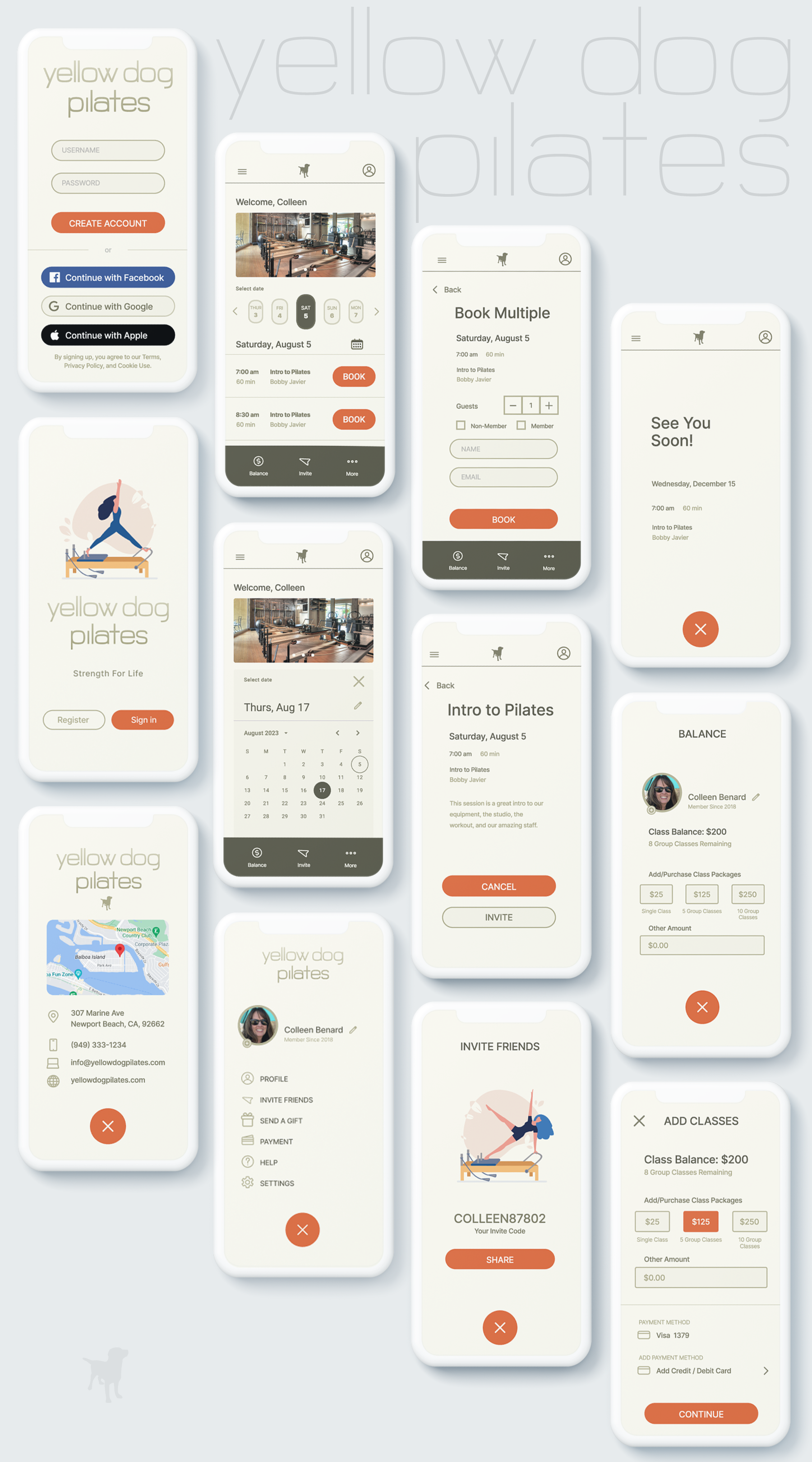
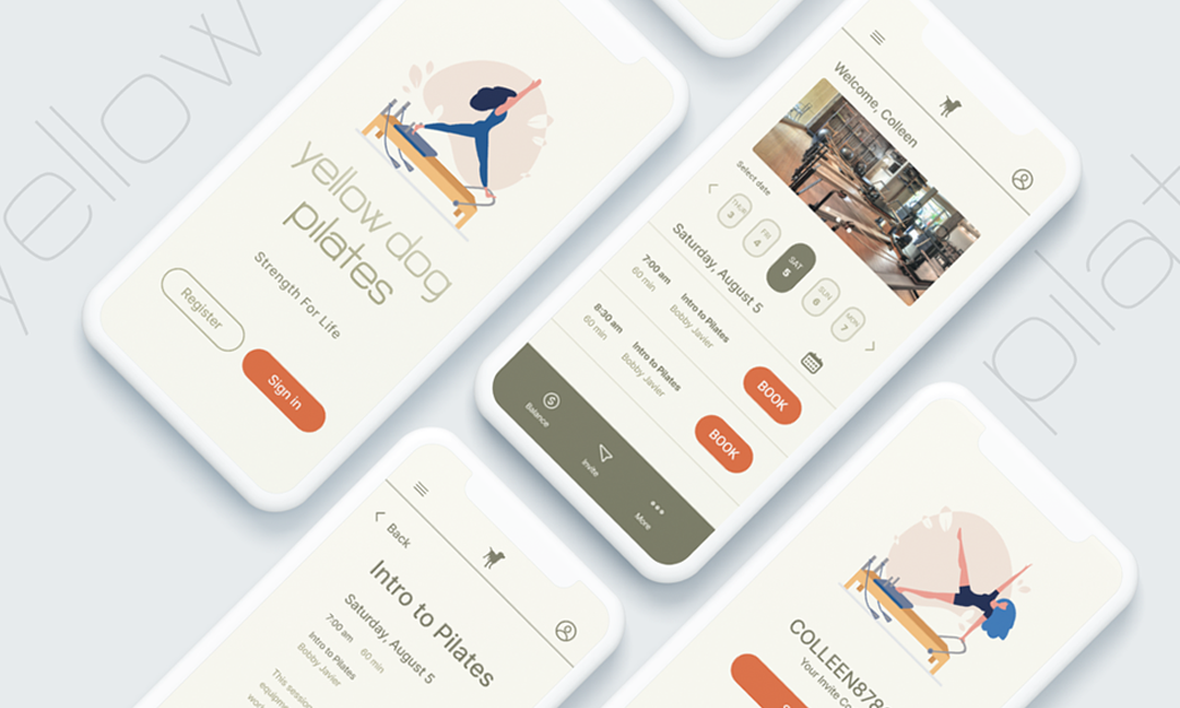
User Flow / Final Screens
The final design streamlines the booking process by guiding users through a clear, step-by-step flow, making it easier to find, evaluate, and reserve classes quickly.
Conclusion
This project focused on reducing friction in the booking experience by simplifying navigation, improving clarity, and prioritizing user needs. The result is a more intuitive interface that supports users in quickly finding and booking classes with confidence.
Learnings
This project reinforced the importance of designing for real user behavior—especially in time-sensitive scenarios where clarity and efficiency matter more than visual complexity.
Future Exploration
Future iterations could explore personalized recommendations, saved preferences, and enhanced filtering to further streamline the experience and better support repeat users.