Rethinking the Boarding Pass Experience
UX/UI Design • System Redesign • Information Hierarchy
Project: Boarding Pass UX/UI Redesign
Role: UX/UI Designer
Tools: Figma, Adobe Illustrator
Outcome: Improved clarity and usability by restructuring how critical information is presented
Who I Worked With: Self-initiated project.
Focused on analyzing and improving a real-world system through research and design exploration. Since completing this work, many boarding passes have evolved to include dynamic updates—such as real-time gate changes and visual cues—reflecting a shift toward more responsive and user-focused design.
Background
During frequent travel, I noticed consistent friction in how boarding passes communicate critical information. Despite being a key part of the airport experience, many boarding passes are difficult to quickly scan and understand—especially in time-sensitive situations.
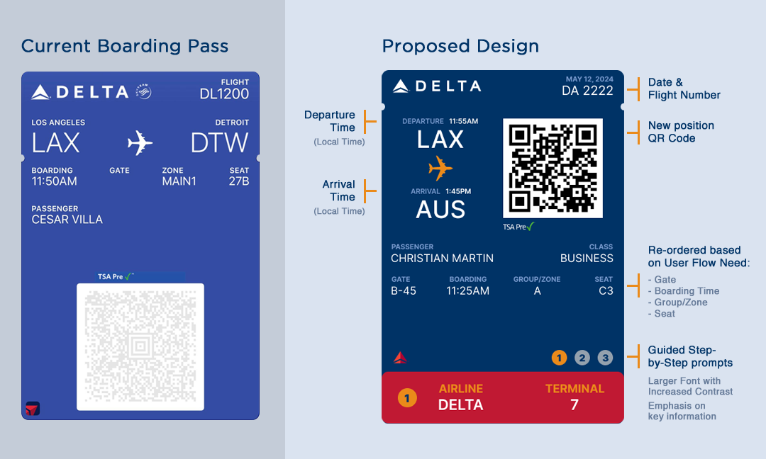
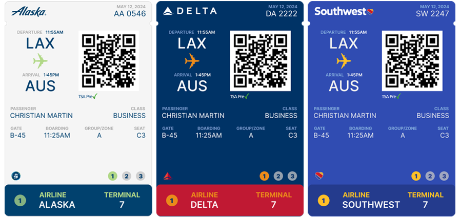
From Dense Information to Clear Hierarchy
Before
Dense layout with low visual hierarchy
Key details are difficult to locate quickly
Inconsistent structure across airlines
After
Clear hierarchy prioritizes essential information
Faster scanning and recognition
More consistent and intuitive structure

The Problem
Critical information is not clearly prioritized
Visual hierarchy makes scanning difficult under time pressure
Inconsistent layouts across airlines create confusion
Users must search for key details instead of recognizing them instantly
Process Intro
To better understand the problem, I analyzed existing boarding passes across multiple airlines and broke down their structure to identify inconsistencies and usability issues.

Sketches / Early Ideation
Early sketches explored how to restructure information hierarchy, focusing on making key details immediately visible and easy to scan.

Research / Thinking
I focused on identifying the most important pieces of information users need at different stages of travel—such as check-in, security, and boarding—ensuring the design supports real-world usage.
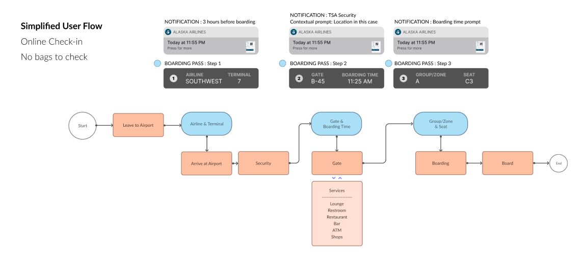
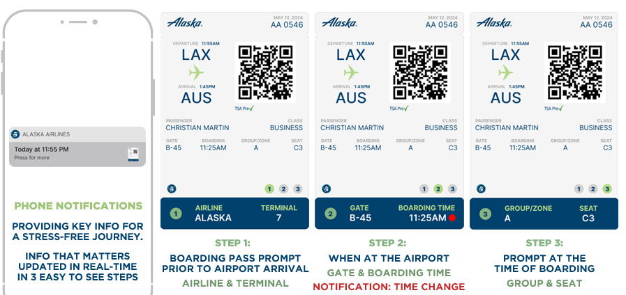
User Flow / System Thinking
I mapped the boarding process to understand when and how users interact with their boarding pass, allowing the design to better support quick reference and decision-making in fast-paced environments.
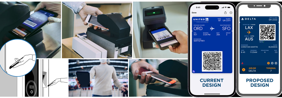
Solution
The redesigned boarding pass prioritizes clarity and usability by organizing information based on importance and frequency of use. Key details such as boarding group, seat, and gate are immediately visible, reducing the need for users to search under time pressure.
Design Execution
The final design introduces a clear visual hierarchy, improved spacing, and consistent structure across airlines, creating a more intuitive and accessible experience.
Impact
This redesign improves readability, accessibility, and usability by aligning the boarding pass with real user behavior. By prioritizing clarity and reducing cognitive load, the experience becomes more intuitive—especially in fast-paced airport environments.
Conclusion
This project demonstrates how thoughtful design can improve everyday systems by focusing on clarity, structure, and real-world usability. By rethinking how information is presented, even familiar experiences can become significantly more efficient and user-friendly.
Learnings
This project reinforced the importance of designing for real-world conditions, where users need to process information quickly and with minimal effort. Clarity and hierarchy often matter more than visual complexity.
Future Exploration
Future iterations could explore dynamic or personalized boarding passes, adapting information based on timing, location, or user needs to further enhance usability.