
Brand Design • Product Thinking • Landing Page Experience
Shaping a Product Identity for Market Validation
Project TinCan Brand & Landing Experience
Role Brand Designer / UX/UI Designer
Tools Figma, Adobe Illustrator, Adobe Photoshop
Outcome Created a cohesive brand and landing experience to support early-stage product validation
Who I Worked With Collaborated with a small team to help define the brand direction and create a landing experience that clearly communicates the product’s value.
Background
TinCan is a concept focused on enabling a new kind of travel experience centered around flexibility and connection. At an early stage, the goal was to create a strong visual identity and a landing page that could communicate the idea clearly and support initial market validation.
Problem
The product concept lacked a clear visual identity
Messaging did not effectively communicate the value proposition
The experience needed to quickly build trust and interest
No structured landing page existed to support validation
Goals
Define a cohesive and recognizable brand identity
Define a cohesive and recognizable brand identity
Support early user interest and engagement
Establish a foundation for future product development
Design Process
The process focused on aligning brand, messaging, and user experience. I explored visual directions, defined core brand elements, and translated those into a structured landing page designed to communicate value quickly and clearly.
User Experience / Information Architecture
The landing experience was designed to guide users through the concept in a clear and engaging way—introducing the idea, explaining how it works, and encouraging action through a structured and intuitive flow.
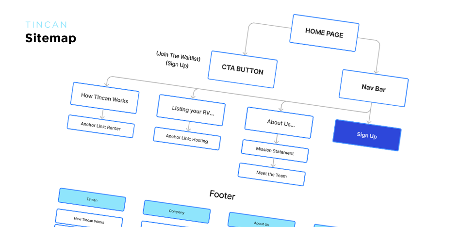
Sitemap
A simplified structure was created to ensure the landing page flows logically, helping users quickly understand the product and its value.
Logo and Branding
The visual identity was designed to feel approachable and adventurous, reflecting the spirit of travel while maintaining clarity and consistency across all touchpoints.
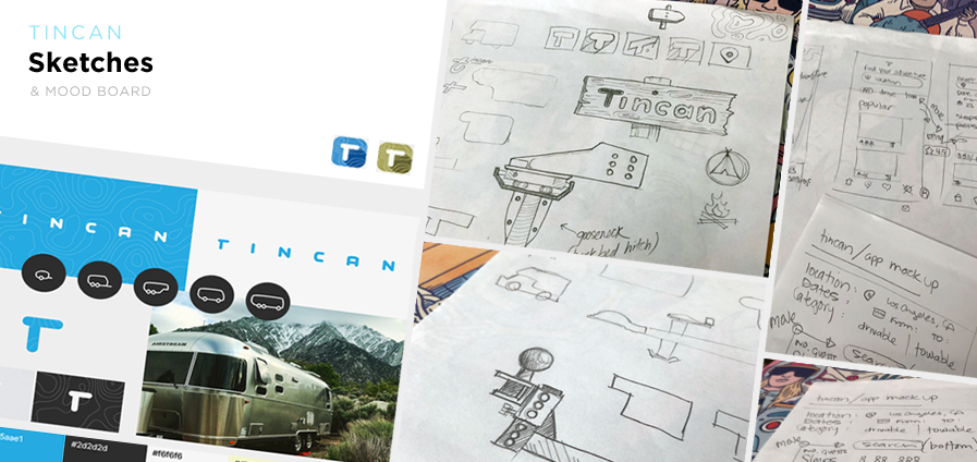
Sketches
Early sketches explored layout, structure, and key components of the landing experience, focusing on how to communicate the concept efficiently.
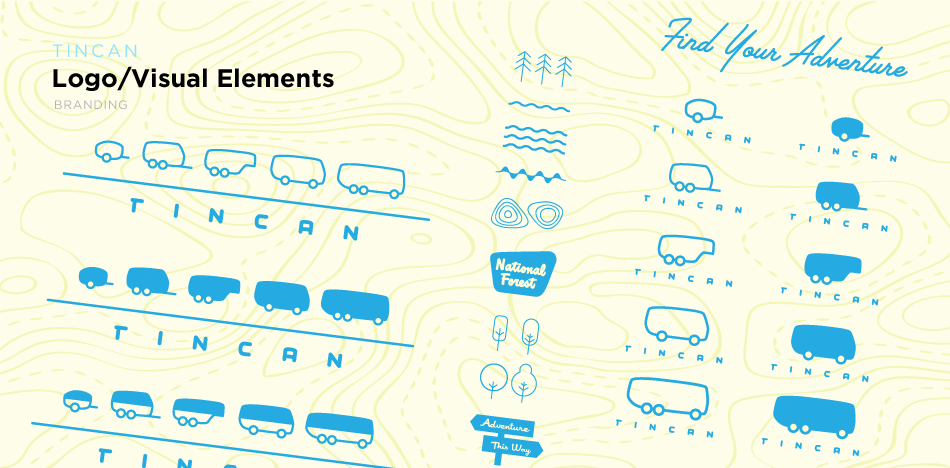
Visual Elements
Visual elements were developed to support the brand system, including icons, typography, and supporting graphics that reinforce the overall identity.
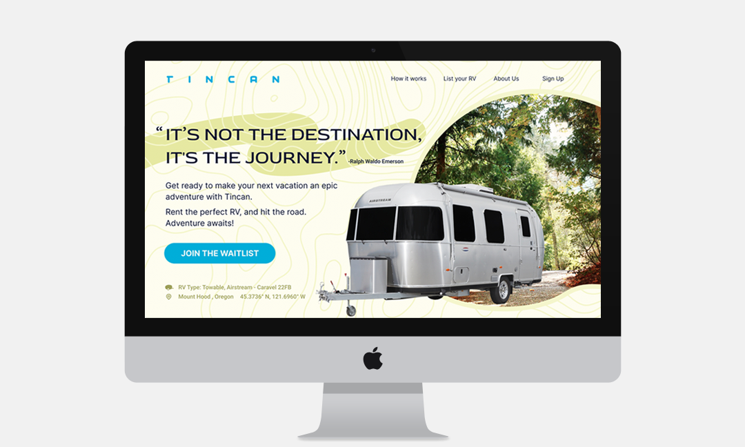
Landing Page Design:
The landing page brings together brand, messaging, and structure into a cohesive experience. It introduces the concept, explains how it works, and builds trust through clear communication and visual consistency.
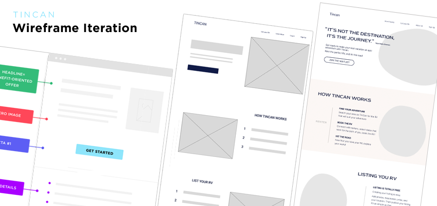
Wireframe Iterations
Iterations focused on refining layout and hierarchy, ensuring the most important information is presented clearly while maintaining a smooth and engaging flow.
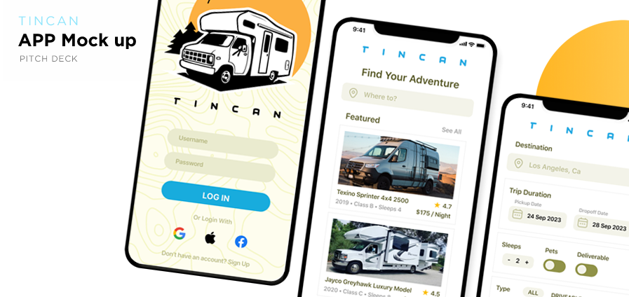
Final Execution / Mockups
Iterations focused on refining layout and hierarchy, ensuring the most important information is presented clearly while maintaining a smooth and engaging flow.
Conclusion:
This project demonstrates how thoughtful design can help shape early-stage ideas by aligning brand, messaging, and user experience. By creating a clear and engaging foundation, the concept is better positioned for validation and future growth.
Learnings
This project reinforced the importance of clarity in early-stage products—where strong branding and structured communication play a critical role in helping users quickly understand and engage with a new concept.
Future Exploration
Future iterations could explore deeper product features, user onboarding flows, and additional touchpoints to further validate and expand the experience.
